D²
Back

From a sticky header idea to a full navigation overhaul

eCom
This project started with a question I raised, not an assignment I received. I proposed exploring a sticky header approach. That small exploration surfaced bigger problems. The merchandising team had no control over dynamic links. Promotional space in the mega menu was limited to a single block. And the navigation architecture couldn't support features on the product roadmap. When a new VP arrived wanting better entry points for marketing campaigns, the timing lined up. Because I'd already been thinking about these problems, I was positioned to lead what became Header / Navigation 2.0. A redesign spanning the header, mega menu, and mobile navigation. Phase 1 is live, and the foundation supports upcoming features like Mix Mode Cart.
Role:Lead UX/UI Designer
Platform:Desktop & Mobile Web
Timeline:Multi-phase initiative
Status:Phase 1 launched and live
Case study image 1
Case study image 2
The Problem

The Problem

The merchandising team was bottlenecked by rigid navigation

The digital merchandising team had no way to control dynamic or seasonal links. Every campaign cycle required engineering support. Holidays, seasonal promotions, limited-time offers. All of it needed tickets, prioritization, and developer time for changes that should have been self-service.

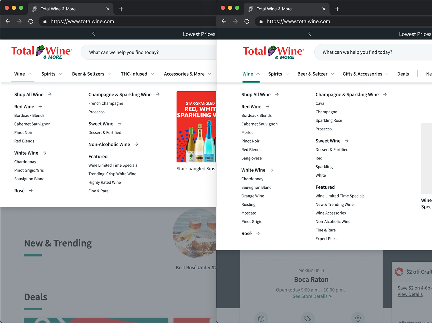
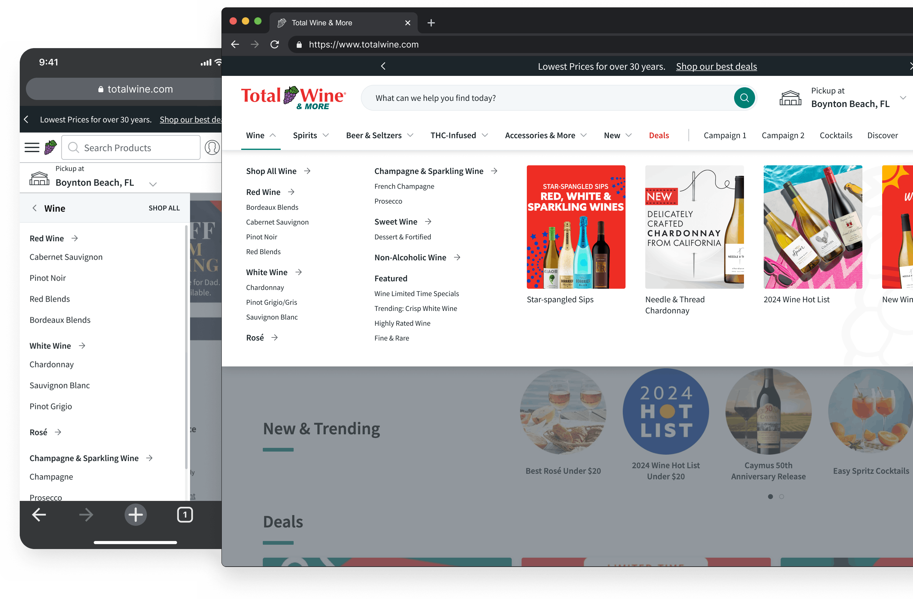
The mega menu was wasting promotional space

Only one marketing block existed in the mega menu. For a retailer with thousands of SKUs across wine, spirits, and beer, that meant campaigns the merchandising team was actively investing in had almost no visibility where it mattered most.

The navigation couldn't support the product roadmap

Upcoming features like Mix Mode Cart needed a navigation architecture that didn't exist yet. Without a redesign, the team would either retrofit new features into an inflexible system or delay roadmap items until the foundation was rebuilt. Both options got more expensive over time.

Design Goals

Unblock the merchandising team

Give them direct control over dynamic and seasonal links. No engineering dependency for routine updates.

Expand promotional capability

Create dedicated promotional space in the mega menu that didn't currently exist.

Establish a scalable foundation

Build an architecture that supports upcoming roadmap features without requiring rework.

Solutioning

Shaping direction with limited guidance

The mega menu portion came with almost no direction. Just a general sense that it needed improvement. I didn't wait for clearer requirements. I defined the path forward myself. I expanded the marketing blocks from 1 to 4. That was my call, based on merchandising needs and competitive patterns. Not a spec I was given. It was a capability I identified as missing and designed into the system. I went with a wider layout, more generous spacing, and better scannability. The old mega menu was dense and cramped. I made the decision to prioritize breathing room over information density, betting that easier scanning would outweigh slightly more scrolling. I also created operational guidelines for the merchandising and ops teams. How many links each section could support. How promotional blocks should be used. What content patterns would work within the system. None of this existed before. I built it to make sure the design held up in daily use, not just in mockups.

Key Design Decisions

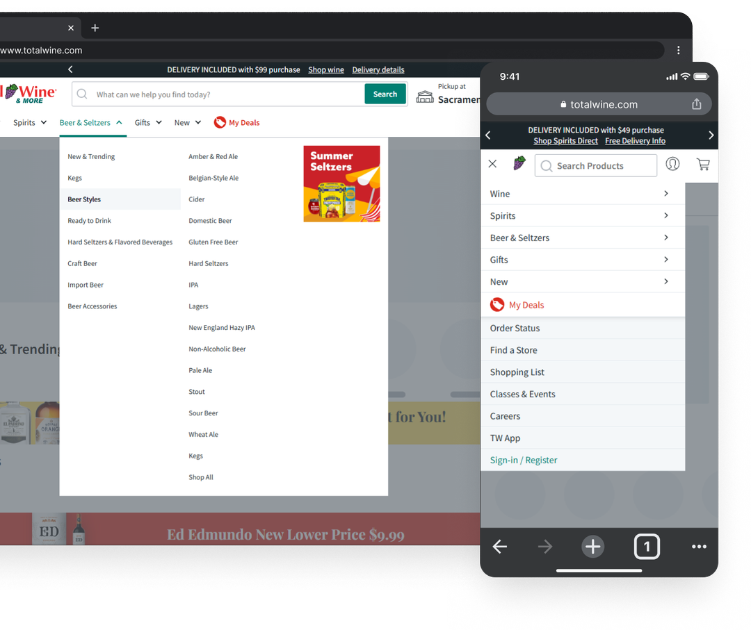
Header bar redesign:

Redesigned core header components with new dynamic seasonal link capability that puts control directly in the merchandising team's hands. Search bar, account login, store selection, primary navigation. All updated.

Mobile web navigation:

Cleaner, more balanced hierarchy in the mobile flyout. The navigation improvements needed to work across devices, not just desktop.

Phased rollout:

Led a phased implementation to reduce risk and allow for incremental validation instead of one high-stakes launch.

Design constraint mockups and stakeholder alignment

Influencing

Defending design constraints against scope creep

The merchandising team wanted way more links in the mega menu than the design could handle. More links meant a bigger vertical footprint, harder scanning, and a worse experience. But "more options" felt like a win to stakeholders who weren't thinking about cognitive load. I didn't argue in the abstract. I mocked up exactly what their request would look like. The oversized mega menu. The wall of text. The loss of scannability. Once stakeholders could see the problem instead of just hearing about it, they agreed to the content limits. Those limits are now the standard the merchandising team operates within.

Navigating disagreement on the Deals navigation item

There was a debate about how "Deals" should appear in the main navigation. It already had a different color to draw attention, but it also had an icon that some stakeholders felt made it stand out too much. I pushed for removing the icon. The color difference was enough, and the icon created visual inconsistency that cheapened the header. Small decision, but it required getting consensus across people with different priorities.

Cross-functional alignment

I was the primary design representative across merchandising, analytics, product management, and engineering. I built alignment through ongoing reviews rather than banking on one big reveal.

Stakeholder reception

The VP of Digital Merchandise responded enthusiastically to the initial designs. The merchandising team confirmed the new dynamic link capability solved the workflow problems they'd been dealing with.

Outcomes

Originated and led a major initiative

This didn't land on my plate. A proactive proposal to explore sticky header behavior opened the door to a broader overhaul. When the timing was right, I was positioned to lead because I'd already been thinking about it.

Eliminated engineering dependency for merchandising

Seasonal campaigns that used to require engineering tickets are now self-service. The merchandising team has direct control over dynamic link content.

Created promotional space that didn't exist before

The expanded mega menu has 4 dedicated marketing blocks where only 1 existed before.

Established content guidelines still in use

The link limits and content guidelines I created and defended are now the operating standard for the merchandising and ops teams.

Successfully launched

Phase 1, including primary navigation, dynamic seasonal links, and the redesigned mega menu, is live in production.

eCom — Mobile Account Screen
Previous Project

A 46% task failure rate hiding in plain sight

Total Wine & More

SaaS — Ironclad Restoration Dashboard
Next Project

From Google Forms to a production SaaS platform

Coming Soon