A 46% task failure rate hiding in plain sight


The Problem
Low engagement and public frustration
Users couldn't tell core features apart
Tree testing showed just how broken things were
A remote unmoderated tree test with 13 participants put numbers on what had been gut feelings:
Updating a payment method
TASK
You're getting a new credit card and want to update the one saved to your Total Wine account. Where would you go to do this?
FINDING
11 of 13 users looked in the wrong section entirely.
TAKEAWAY
Payment method should live in the Profile section
"For me, a credit card setting is more a profile thing than a preference. I thought preferences would be more about sending notifications, allowing location sharing, etc."
Design Goals
Fix the structural IA failures
Get to the root cause of the 46% payment method failure and the My Lists/Order History confusion. Not just the symptoms.
Increase discoverability of high-value features
Surface loyalty, rewards, and reorder pathways that were buried.
Turn a utility screen into something people actually visit
The account section was a screen people went to only when they had a problem. It needed to become somewhere worth going back to.
Solutioning
Defining the problem before designing the solution
Structural IA fixes
Payment Method → Profile:
Testing revealed 85% of users expected payment settings in Profile, not Preferences. So I moved it there. That's a structural fix grounded in evidence, not a guess.
Clarified labeling:
Addressed the My Lists / Order History confusion by aligning labels with what users actually expected and separating the concepts more clearly in the hierarchy.
Removed broken-looking elements:
Fixed the "&More" formatting that users thought was broken.

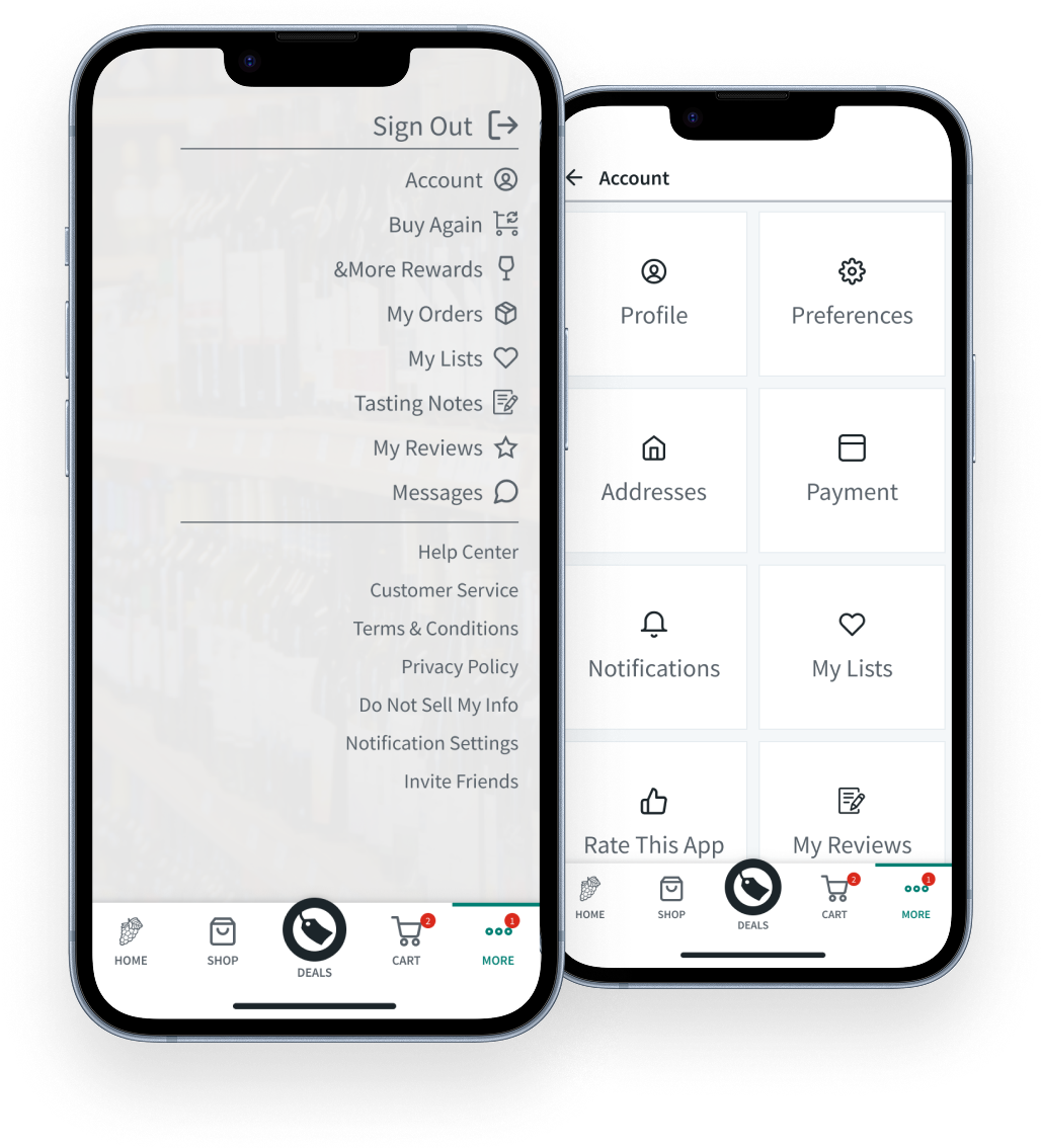
Previous State Pathing Audit

New Pathing
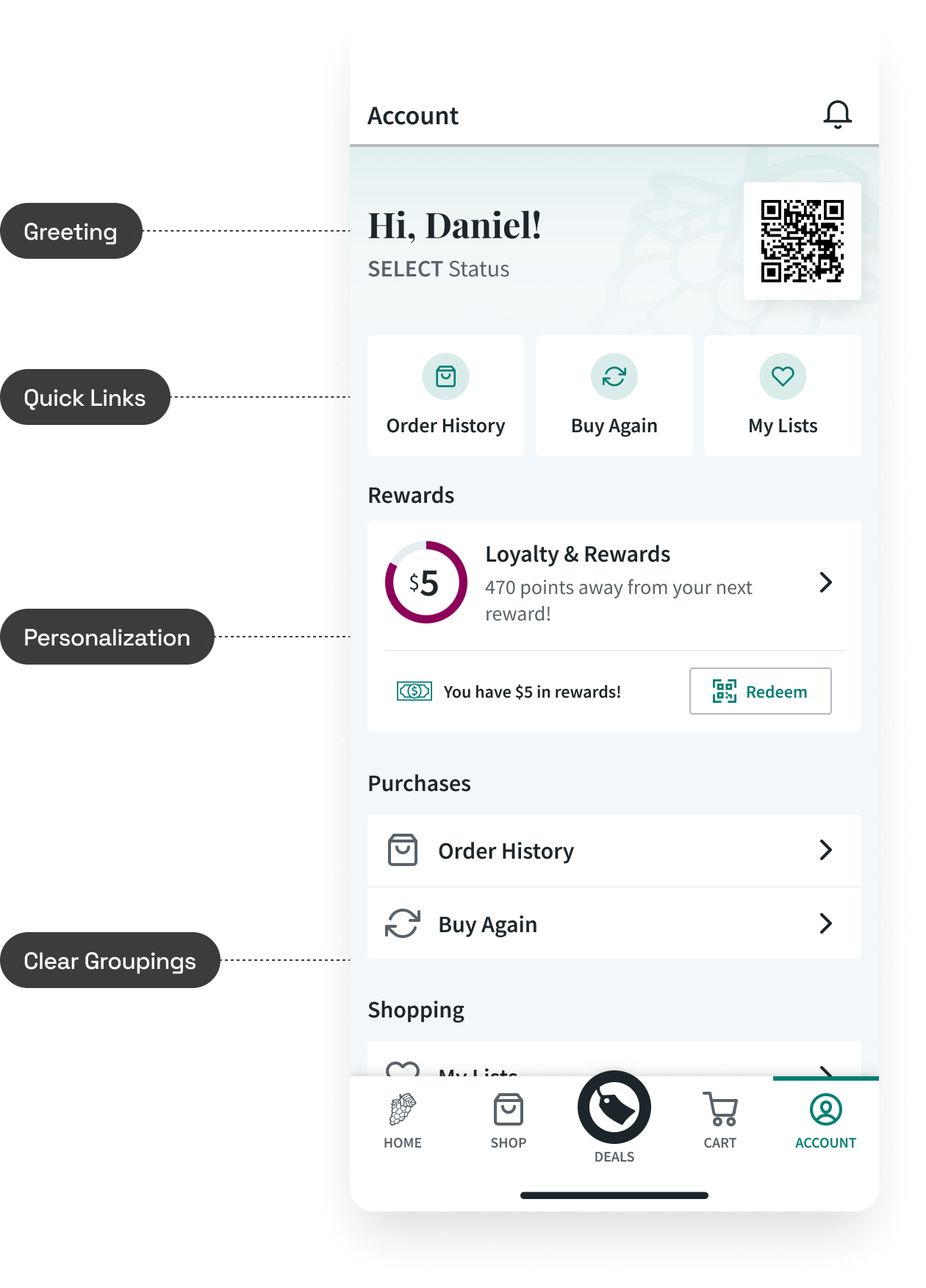
Personalization & Engagement Features
Simplified navigation:
Combined "More" and "Account" into one unified page. Fewer taps, easier wayfinding.
Smarter entry points:
Added quick links above the fold for the most-used actions, informed by app analytics. The data made the prioritization defensible rather than opinion-based.
Personalization and engagement:
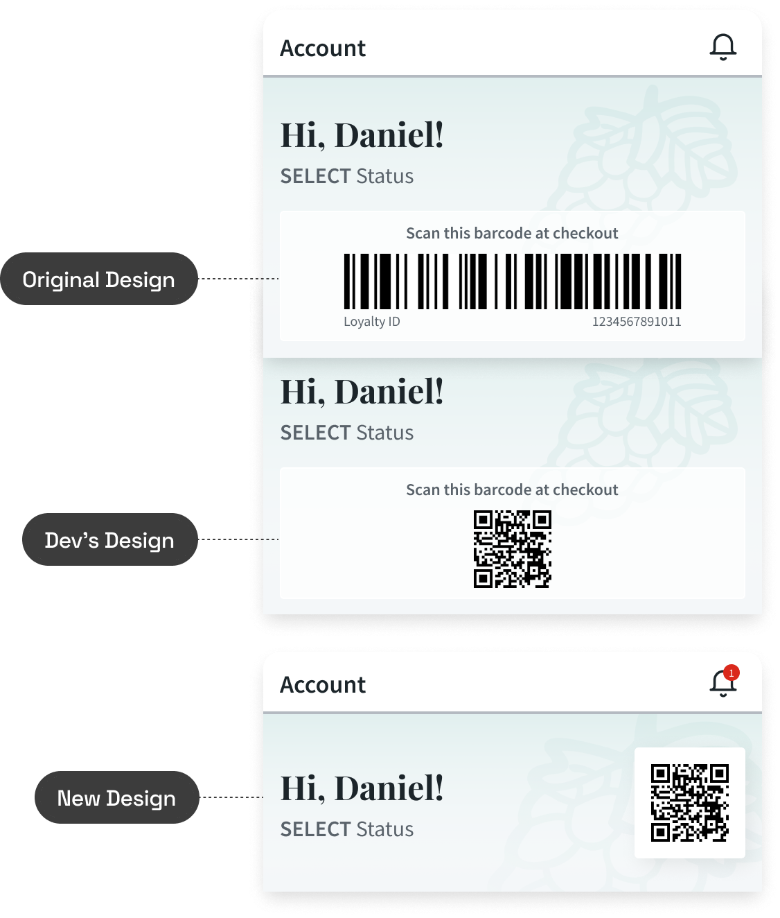
Added a personalized greeting, a preview of the next reward to encourage loyalty engagement, and surfaced the loyalty barcode for quick in-store access. The goal wasn't just fixing what was broken. It was creating new value from a screen that previously offered none.
Improved usability:
Redesigned the layout with clear section titles and chunked content for easy scanning. Left-aligned layout with stronger visual hierarchy, consistent icons for faster recognition, and "Sign Out" pushed to a less prominent spot where it belongs.
Influencing
Data changed stakeholder minds
Same-day pivot under pressure
Cross-functional collaboration

Outcomes
task failure rate on payment updates uncovered in baseline tree testing
task success rate in validation testing, up from 77%
directness in validation testing, up from 46%
Reframed the project through diagnosis
What started as "refresh the account page" became "fix a fundamentally broken IA" because I invested in understanding the problem first. The 46% failure rate discovery changed the project's scope and urgency.
Testing directly changed the shipped design
Tree test results overruled initial assumptions. Payment Method was relocated because 11 of 13 users expected it somewhere else. The shipped product is measurably different because of the research.
Maintained quality under pressure
When a mid-development technical constraint threatened the design, I delivered a same-day solution and got engineering buy-in.
Positive reception across validation methods
UserTesting.com sessions got positive feedback. In-store demos with real customers generated strong responses. Internal stakeholders reacted well during the tech demo.
Shipped and live
The redesigned account section is in production and available to all app users.

