D²
Back

I needed a better gut health app. So I built one.

Mobile App
I manage a chronic digestive condition. That means daily bowel tracking is part of my life. The apps out there are either sterile medical tools or novelty apps covered in toilet emojis and cartoon imagery. After months of using an app that made me cringe every time I opened it, I decided to design the one I actually wanted. Then I built it. I'd never built a native app before. My development experience was all web. But I designed and built the whole thing myself using AI-assisted development tools. 33 screens, 5 tracking domains, offline-capable cloud sync. It's a real product approaching public launch. Not a prototype. Not a Figma exercise.
Role:Solo Designer and Product Owner
Platform:iOS and Android (React Native)
Timeline:Solo build, start to finish
Status:Pre-launch, core product complete
Case study image 1
Case study image 2

The Problem

Nobody was treating gut health tracking as a real design problem

The apps in this space split into two camps. Clinical tools with zero personality, or novelty apps that embarrass you to open in public. The feature gap between them is small. The design gap is enormous.

Choosing between thoroughness and experience

Apps with clinical-level detail bury it behind dense forms. Apps that feel easy to use sacrifice the depth that makes tracking useful. Users have to choose between thoroughness and experience quality. That's a design failure, not a technical one.
The Problem

Design Goals

Tasteful, not embarrassing

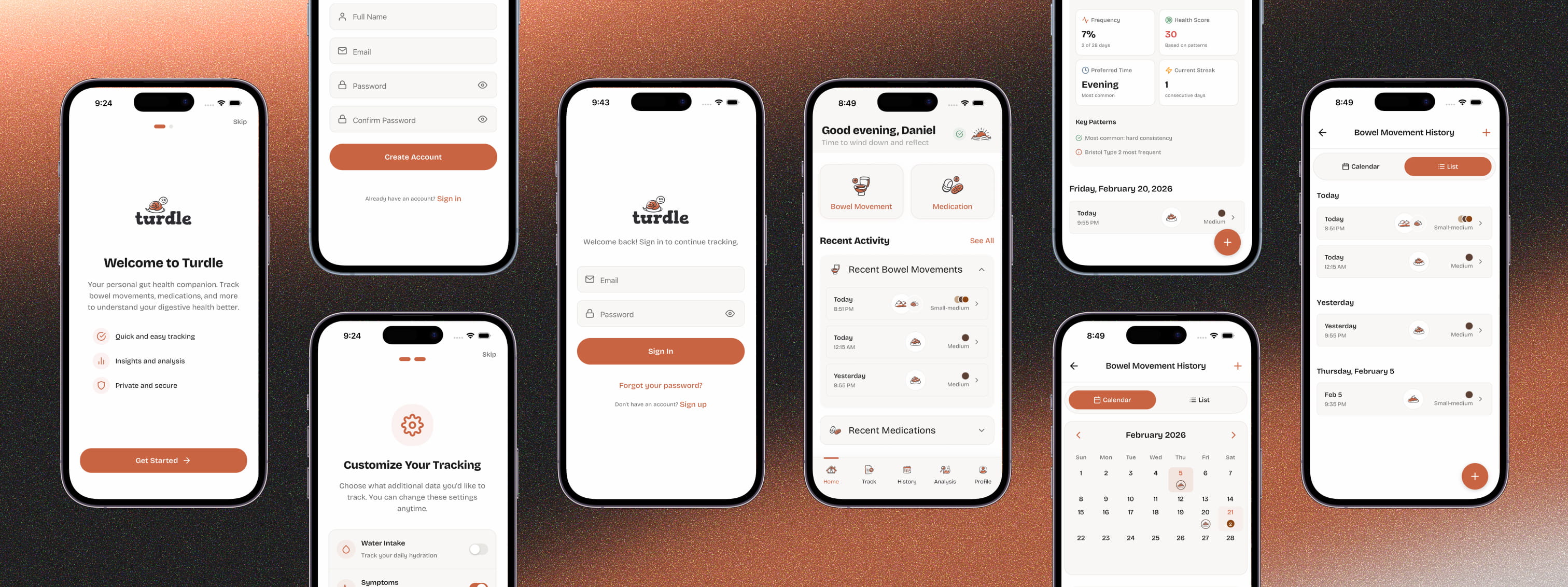
The app doesn't hide what it tracks, but it treats the subject with more sophistication than the competition. Custom illustrated icons replace the cartoon emojis and toilet imagery that dominate the space. The aesthetic is playful and warm, not clinical or juvenile.

Playful, not childish

The tone had to be warm enough to lower daily logging friction, but mature enough not to undermine what it's tracking. The name "Turdle" captures this. A wink, not a joke.

Fast for quick logs, deep for detailed ones

The app tracks a lot. Bowel movements across 10+ dimensions. Food with allergen flags. Symptoms with condition-specific detail forms. Medications. Water intake. Every flow needed to feel quick for a basic entry but expandable for someone who wants clinical-level detail.

Solutioning

Guided flows over form fields

The core design decision was rejecting forms. Every competitor uses them. Instead, each tracking type uses a step-by-step guided flow. The essentials come first for speed. Enhanced detail steps are always there for depth. Logging feels like answering a few quick questions, not filling out a medical intake form.
Turdle bowel movement tracking: step-by-step guided flow (Stool Type, Size & Color, Details, and summary confirmation)
Turdle home and "What would you like to track?" modal showing five tracking domains: bowel movement, medication, food & drink, water intake, and symptoms

Key design and technical decisions

Progressive disclosure across five tracking domains:

Turdle tracks bowel movements, food, symptoms, medications, and water intake from one home screen. Making all of that accessible without overwhelming people was the main challenge. Progressive disclosure does the work. You only see what's relevant to your current step and tracking type.

A visual identity that earns trust:

I designed Turdle's brand identity from the ground up — logo, color palette, and visual language. The interface uses warm, earthy tones. Terracotta and sage instead of the sterile blues most health apps default to, or the bright novelty colors gut trackers tend toward. Custom icons, branded illustrations, and a paper texture background give it the feel of a thoughtfully designed journal rather than a medical tool.

Turdle app theme and style guide showing logos, Bricolage Grotesque typography, UI components, custom illustrated icons, and warm terracotta-to-sage color palette
Turdle Analysis screens: consistency and color distribution charts, AI pattern insights, Bristol type distribution, and health recommendations

Analysis that gives something back:

Logged data feeds into an analysis engine that surfaces trends, identifies potential triggers, and generates AI-powered insights. Animated charts, health indicator grids, and recommendation cards. The goal was making the daily effort of tracking feel worth it by turning data into something useful.

Offline-first architecture:

Health logging doesn't wait for Wi-Fi. The app uses local storage as the source of truth with automatic cloud sync when connected. Failed syncs get tracked and retried so you never lose an entry.

Turdle app overview: onboarding, account, home dashboard, tracking, history, and analysis screens

Influencing

01

Scoping for one person without shrinking the product

The hardest part of a solo project isn't any single screen. It's deciding what to build and what to cut when nobody else is drawing the line. I scoped Turdle to 33 screens and 5 tracking domains. Every screen earned its place. The discipline was in what I left out. Social features, doctor-sharing workflows, and a complex analytics suite were all considered and deliberately cut. Not because they don't have value, but because they didn't belong in v1. A focused, polished product beats an ambitious, unfinished one.
02

Choosing restraint over feature density

When you're both designer and builder, the instinct is to show everything you've made. I kept editing toward restraint. Each tracking flow could have shown all 10+ data dimensions at once. Instead, I designed stepped flows that front-load essentials and make depth optional. Slightly more taps for power users, but dramatically less friction for daily use.
03

Picking tools for sustainability

Every technical decision was filtered through one question. Can I maintain this long-term as one person? React Native for cross-platform reach from a single codebase. Supabase for managed backend infrastructure. Zustand for lightweight state management. The best choices for a solo developer aren't always the best choices for a team. That distinction shaped the whole architecture.
04

Using AI as a development partner

I've built web frontends before, but I'd never touched native app development. AI-assisted tools let me translate my design decisions into working React Native code. I owned every architectural choice. Navigation structure, data models, component hierarchy, visual system. AI handled implementation at a pace I couldn't have matched alone. 33 screens and 230+ components without a development team. The real skill is knowing where AI speeds up your work versus where it replaces your judgment. I kept it on the speed side.

Outcomes

Shipped a production-grade app solo

33 screens, 5 data stores with full sync logic, 230+ components. Authentication, cloud sync, offline capability, production-level state management. Not a prototype.

Proved what one designer can ship with the right workflow

I paired design ownership with AI-powered development and compressed what would normally be a multi-person effort into a solo build. This isn't a one-time experiment. It's a repeatable workflow.

Brought real design quality to an underserved space

The gut health tracking space is full of apps that are either functional but ugly, or playful but embarrassing. Turdle shows you can build something clinically comprehensive that people actually want to use. Treating design as a first-class problem is the whole differentiator.

Current status

Core tracking, sync infrastructure, and analysis features are complete. Final polish and App Store preparation are the remaining work before public launch.

SaaS — Ironclad Restoration Dashboard
Previous Project

From Google Forms to a production SaaS platform

Coming Soon

eCom — Mobile Account Screen
Next Project

A 46% task failure rate hiding in plain sight

Total Wine & More